Brand Guidelines

The Architect brand.

Our brand identity reflects precision, trust, and modernity. Use these assets and guidelines to represent Architect and our products consistently across all media.

Download brand kit ZIP · all logos in SVG and PNG, plus usage notes
01

Architect logo

The Architect logo consists of the terminal-bracket symbol and wordmark. Always use the provided assets — never recreate or modify the logo.

Architect logo, white
Full Logo — White For dark backgrounds
Architect logo, dark
Full Logo — Dark For light backgrounds
Architect symbol, white
Symbol — White Dark backgrounds
Architect symbol, blue
Symbol — Blue Brand accent
Architect symbol, dark
Symbol — Dark Light backgrounds
Do
  • + Use the provided logo files at their original proportions
  • + Maintain minimum clear space equal to the symbol height
  • + Use white logo on dark backgrounds, dark logo on light
  • + Scale the logo proportionally at any size
Don't
  • − Stretch, rotate, or distort the logo
  • − Add effects like drop shadows, glows, or gradients
  • − Place on busy backgrounds without sufficient contrast
  • − Change the logo colors or use unapproved variations
02

Product logos

Each Architect product has its own mark. Pair a product mark with its full name the first time it appears, and follow the same usage rules as the Architect logo.

AX Exchange

AX Exchange mark, white
AX Mark — White For dark backgrounds
AX Exchange mark, black
AX Mark — Black For light backgrounds

American Innovation Exchange

American Innovation Exchange mark
AI Exchange Mark Full color, for light backgrounds

Liquid Inference

Liquid Inference mark
Liquid Inference Mark Works on light and dark backgrounds
03

Color palette

Click any swatch to copy its hex value. Our palette is built around deep darks, clean whites, and a signature blue accent.

Primary

Void #09090F
White #FFFFFF
Architect Blue #3C96DC
Surface #0A0A0F

Accent & UI

Cyan #22D3EE
Sky #449EDD
Indigo #6366F1
Green #10B981
Red #EF4444
Slate #94A3B8
04

Typography

We use two typeface families: Manrope for headlines and Inter for body text, UI, and data. Both are open-source Google Fonts.

Manrope

Manrope

Light 300 Aa Bb Cc
Regular 400 Aa Bb Cc
Semibold 600 Aa Bb Cc
Bold 700 Aa Bb Cc

Inter

Inter

Light 300 Aa Bb Cc
Regular 400 Aa Bb Cc
Medium 500 Aa Bb Cc
Semibold 600 Aa Bb Cc
Type Scale
88px Display
48px Heading 1
36px Heading 2
18px Body large — used for hero subtitles and lead paragraphs.
14px Body — the default size for paragraphs, descriptions, and UI elements.
10px Label — section markers, tags, and micro-copy
05

Photography

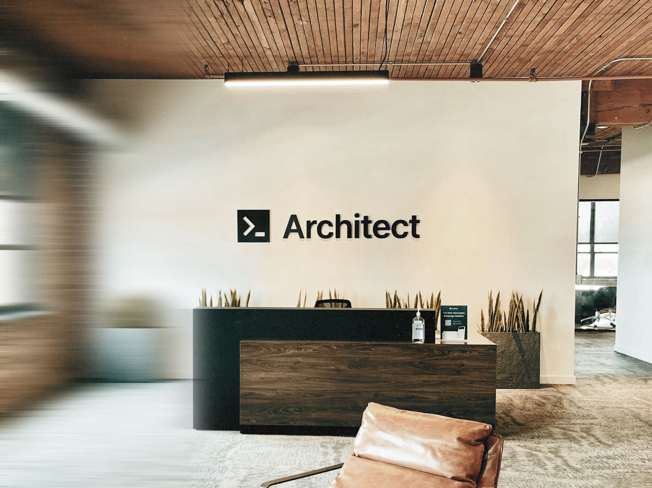
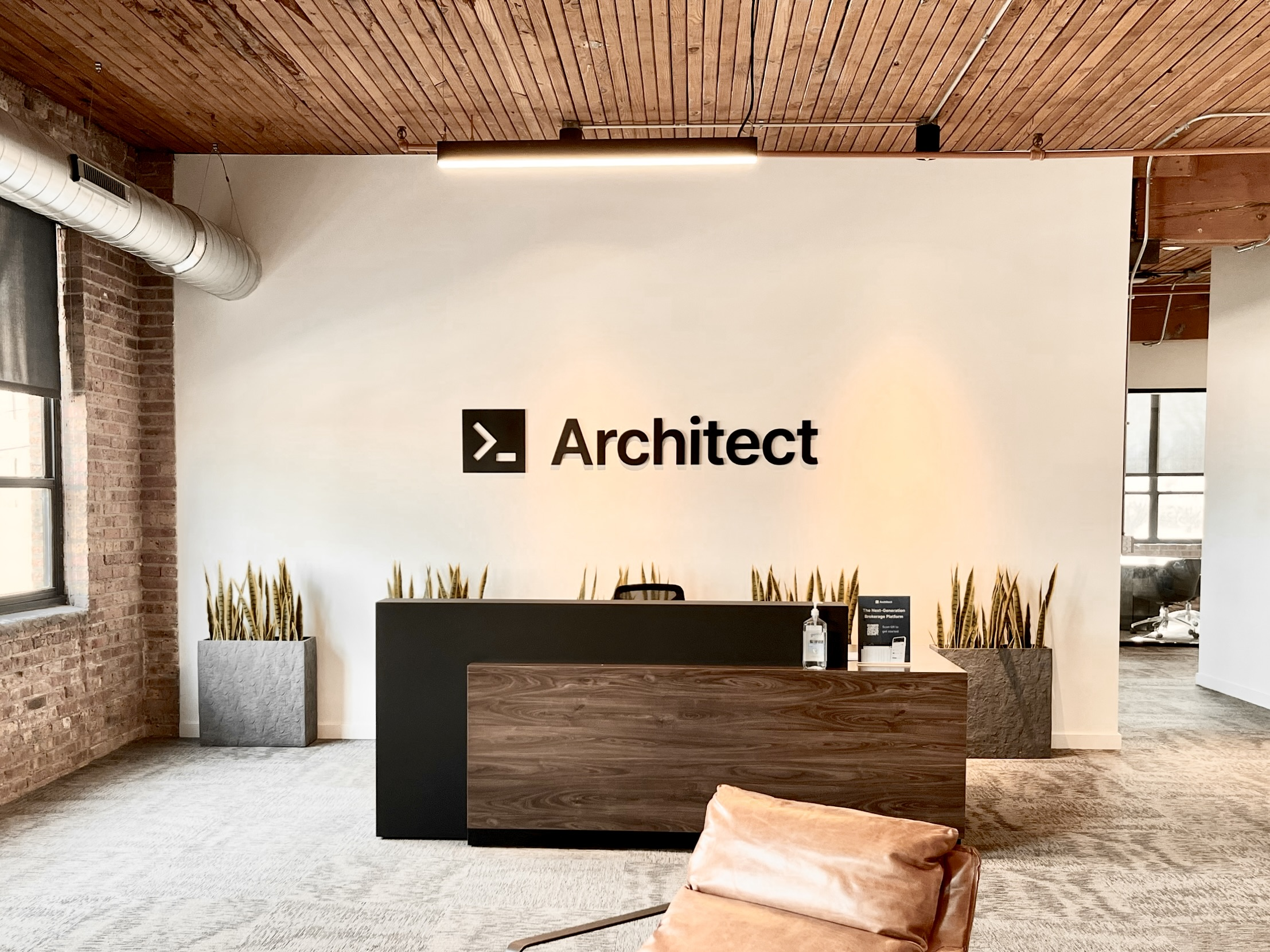
Our photography features warm tones, natural lighting, and architectural details that reflect our brand values of precision and craftsmanship.

Architect office
Architect office lobby
Questions?

Need something specific?

For custom assets, co-branding requests, or press inquiries, reach out to our team directly.

Contact Us